
![]()
Exploratory Data Analysis (EDA) is a foundational method for understanding datasets, revealing patterns, spotting outliers, and uncovering relationships between variables. Often conducted before formal statistical analyses or modelling, EDA is essential in the realm of Data Analytics Services & Solutions. Organizations benefit from the guidance of a data analytics consultant, particularly within analytics and business intelligence platforms. Furthermore, the integration of AI Software Development enhances EDA capabilities, contributing to more profound insights for informed decision-making.
For this demonstration, we will be using the California Housing dataset that can be found on Kaggle. The data pertains to the houses found in a given California district and some summary stats about them based on the 1990 census data.
The dataset consists of the following 10 features:
1. longitude: A measure of how far west a house is; a higher value is farther west
2. latitude: A measure of how far north a house is; a higher value is farther north
3. housing_median_age: Median age of a house within a block; a lower number is a newer building
4. total_rooms: Total number of rooms within a block
5. total_bedrooms: Total number of bedrooms within a block
6. population: Total number of people residing within a block
7. households: Total number of households, a group of people residing within a home unit, for a block
8. median_income: Median income for households within a block of houses (measured in tens of thousands of US Dollars)
9. median_house_value: Median house value for households within a block (measured in US Dollars)
10. ocean_proximity: Location of the house w.r.t ocean/sea
Step 1: Importing necessary libraries
In Python, a library is a collection of pre-written and reusable code modules that can be imported and utilized in your programs. Libraries provide a set of functions and tools to perform specific tasks without having to write the code from scratch. Python has a rich ecosystem of libraries, each designed for specific purposes.
| import pandas as pd import numpy as np import matplotlib.pyplot as plt import seaborn as sns |
- Pandas is a data manipulation and analysis library for Python, supporting Data Frame and Series structures, data I/O, cleaning, indexing, statistical analysis, time series, and more.
- Numpy is a Numerical computing library for Python, providing powerful arrays and mathematical functions, integrated with pandas for efficient data processing.
- Matplotlib.pyplot is a Plotting library for Python, part of the Matplotlib library, commonly used for creating visualizations in data analysis.
- Seaborn is a Data visualization library based on Matplotlib, providing a high-level interface for creating aesthetically pleasing statistical graphics.
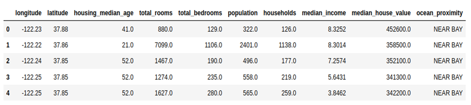
Step 2: Reading the dataframe
| df = pd.read_csv(‘/home/user/Downloads/EDA/housing.csv’) df.head() |
Step 3:
df.info() is a method in the Pandas library for Python that provides a concise summary of a DataFrame. When you call df.info() on a Pandas DataFrame (df is typically used as a common placeholder for a DataFrame), it provides information about:
- The Data Types of Each Column:
It shows the data type of each column in the DataFrame. This is useful for quickly checking if the data types are as expected.
- The Number of Non-null (Non-Missing) Values:
It shows the count of non-null (non-missing) values for each column. This helps in identifying missing data.
- Memory Usage:
It displays the memory usage of the DataFrame. This can be helpful for assessing the memory footprint of your dataset.
| df.info() |
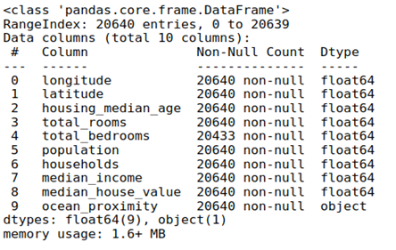
There are 20640 non-null values in every column apart from total_bedrooms, which has 20433 values, and every column contains float values except for ocean_proximity, which is a categorical variable.
Step 4:
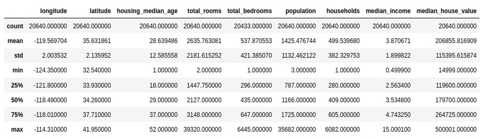
df.describe() is another Pandas method used to generate descriptive statistics of a DataFrame’s numerical columns. When you call df.describe(), it provides summary statistics such as the mean, standard deviation, minimum, maximum, and quartiles for each numerical column in the DataFrame. Here’s an example of what the code and the output might look like:
| df.describe() |
Step 5:
Find out the number of missing values
The code missing_values = df.isnull().sum() is used to calculate the number of missing values in each column of the DataFrame df. Here’s a breakdown of how the code works:
- df.isnull(): This creates a DataFrame of the same shape as df where each entry is True if the corresponding entry in df is NaN (null or missing), and False otherwise.
- .sum(): This sums up the True values (which represent missing values) along each column, giving the total count of missing values for each column.
- The result is stored in the missing_values variable, and when you print it, you get a Series that shows the count of missing values for each column.
| missing_values = df.isnull().sum() print(missing_values) |
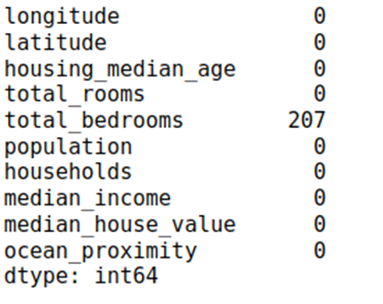
None of the columns have missing values apart from total_bedrooms, which has 207 missing values.
Missing values can adversely impact machine learning models by reducing the amount of information available for training, potentially leading to biased or inaccurate predictions. Addressing missing values is essential, and ensures models make informed decisions despite incomplete data.
Step 6: Checking for outliers
Boxplot: A boxplot is a graphical representation of the distribution of a dataset based on a five-number summary: minimum, first quartile (Q1), median (Q2), third quartile (Q3), and maximum. It’s a useful tool for visualizing the spread, skewness, and potential outliers in the data.
Interpreting a boxplot involves understanding the key components and features it represents. A boxplot provides a visual summary of the distribution of a dataset, helping to identify central tendency, spread, and potential outliers. Here are the key elements of a boxplot and how to interpret them:
- Box (Interquartile Range – IQR):
The box in the middle of the plot represents the interquartile range (IQR), which is the range between the first quartile (Q1) and the third quartile (Q3). The length of the box indicates the spread of the middle 50% of the data.
- Line Inside the Box (Median):
The line inside the box represents the median (Q2) of the dataset. The median is the value that separates the lower and upper halves of the data.
- Whiskers:
The whiskers extend from the box to the minimum and maximum values within a certain range. The range is typically defined as 1.5 times the IQR. Data points beyond the whiskers are considered potential outliers.
- Outliers:
Individual data points outside the whiskers are often plotted as individual points. These are potential outliers, suggesting values that significantly differ from the rest of the data.
- Shape of the Distribution:
The overall shape of the boxplot provides insights into the distribution of the data. For example, if the box is symmetrically centred around the median and the whiskers are of similar length, the data may be approximately normally distributed. Skewness or asymmetry can also be observed.
Interpretation Steps:
- Central Tendency:
Identify the median (Q2) to understand the central tendency of the data. If the median is closer to one end of the box, the distribution may be skewed.
- Spread and Variability:
Assess the length of the box (IQR) to understand the spread of the middle 50% of the data. A longer box indicates greater variability.
- Outliers:
Identify individual data points beyond the whiskers. These are potential outliers that may warrant further investigation. Outliers can significantly impact statistical analyses.
- Symmetry and Shape:
Observe the overall shape of the boxplot. Symmetry and the presence of skewness provide insights into the distribution of the data.
| df_box = df.drop([‘ocean_proximity’,’total_bedrooms’], axis = 1) num_variables = len(df_box.columns) num_rows = int(np.ceil(num_variables / 2)) # Using a Seaborn color palette colors = sns.color_palette(‘husl’, n_colors = num_variables) fig, axes = plt.subplots(nrows = num_rows, ncols = 2, figsize = (15, 5 * num_rows)) for i, (column, color) in enumerate(zip(df_box.columns, colors)): row_index, col_index = divmod(i, 2) # Simplified calculation for row and column indices boxplot = axes[row_index, col_index].boxplot(df_box[column], patch_artist = True, boxprops = dict(facecolor = color), medianprops = dict(color = ‘black’, linewidth = 2)) axes[row_index, col_index].set_title(column) axes[row_index, col_index].set_ylabel(‘Values’) # Remove empty subplots if the number of variables is odd if num_variables % 2 != 0: fig.delaxes(axes[-1, -1]) # Add a legend for the color categories legend_labels = [plt.Line2D([0], [0], marker = ‘o’, color = ‘w’, markerfacecolor = color, markersize = 10) for color in colors] plt.legend(legend_labels, df_box.columns, loc = ‘upper right’) plt.tight_layout() plt.show() |
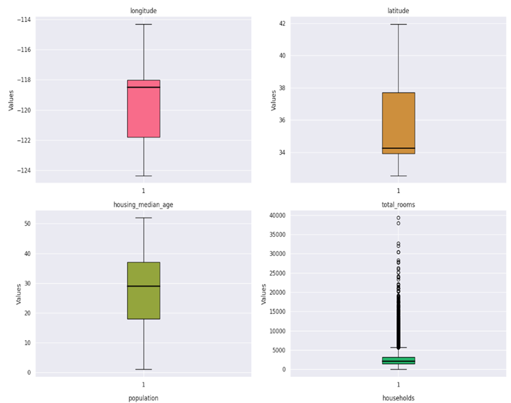
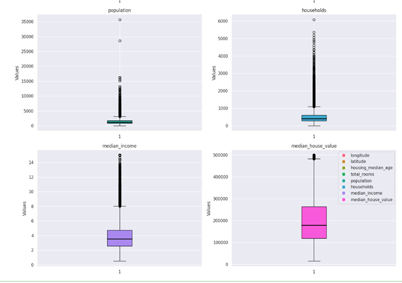
In this case, median_income, total_rooms, population and median_house_values contain outliers.
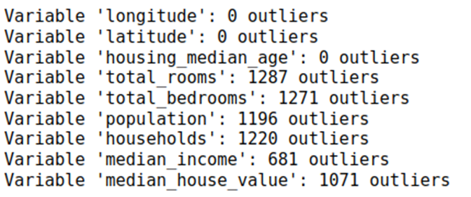
Calculating total number of outliers:
| def count_outliers(series, threshold = 1.5): Q1 = series.quantile(0.25) Q3 = series.quantile(0.75) IQR = Q3 – Q1 lower_bound = Q1 – threshold * IQR upper_bound = Q3 + threshold * IQR outliers = (series < lower_bound) | (series > upper_bound) return outliers.sum() # Calculate and print the number of outliers for each variable for column in df_box.columns: outliers_count = count_outliers(df_box[column]) print(f”Variable ‘{column}’: {outliers_count} outliers”) |
Outliers can significantly impact machine learning models by skewing statistical measures and influencing model parameters. Handling outliers is crucial for model robustness and accuracy, and they are typically handled during the data cleaning and preprocessing stage.
Step 7: Find out the correlation between variables
Correlation matrix: A correlation matrix is a table that shows the correlation coefficients between many variables. Each cell in the table represents the correlation between two variables. The main diagonal usually contains a correlation of 1 because it represents the correlation of a variable with itself.
Correlation coefficients quantify the strength and direction of a linear relationship between two variables. The value of a correlation coefficient ranges from -1 to 1, where:
1: Indicates a perfect positive correlation.
0: Indicates no correlation.
-1: Indicates a perfect negative correlation.
Here are a few key aspects of what a correlation matrix can tell you:
- Strength of Relationship:
The magnitude of the correlation coefficient indicates the strength of the relationship. The closer the absolute value of the correlation coefficient is to 1, the stronger the relationship.
- Direction of Relationship:
The sign of the correlation coefficient indicates the direction of the relationship. Positive values indicate a positive correlation, while negative values indicate a negative correlation.
- Identifying Patterns:
By examining the entire matrix, you can identify patterns of relationships among multiple variables. This is particularly useful when dealing with datasets with many features.
- Multicollinearity:
High correlations between independent variables may indicate multicollinearity, which can affect the performance of certain statistical models.
In Python, you can generate a correlation matrix using the Pandas library with the corr() method. Here’s how:
| correlation_matrix = df.corr() # Visualize the correlation matrix as a heatmap plt.figure(figsize = (7, 5)) sns.heatmap(correlation_matrix, annot = True, cmap = ‘coolwarm’, fmt = “.2f”) plt.title(“Correlation Heatmap”) plt.show() |
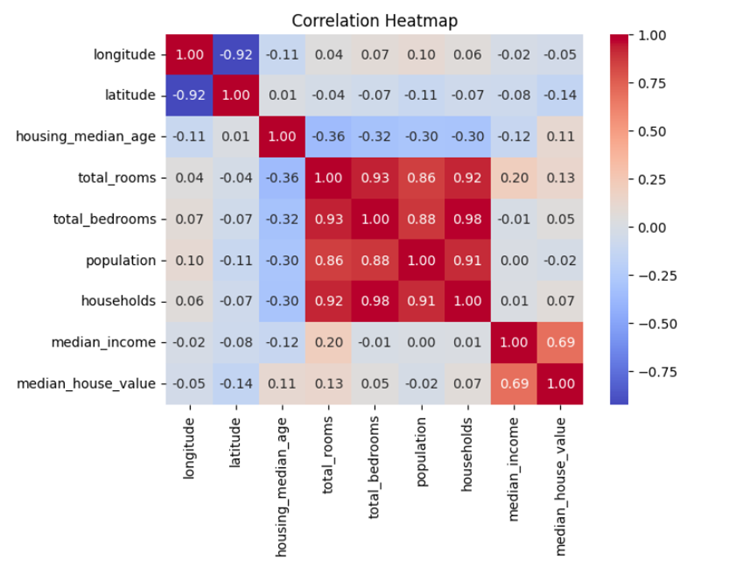
Here we can see that total_rooms, total_bedrooms, population and household have a very strong positive correlation with each other.
Step 8: Find out the distribution of the variables
A distribution plot, often created using Seaborn, is a graphical representation of the distribution of a univariate dataset. It displays the probability density function (PDF) of the data and can include additional information such as a histogram and kernel density estimate (KDE).
The distribution of data plays a vital role in machine learning models, influencing model assumptions and performance. Skewed or non-normal distributions may lead to biased predictions. Addressing distribution issues involves techniques such as log transformations, scaling, or applying appropriate probability distributions to align data with model assumptions and improve predictive accuracy.
Here’s an example of how to create a distribution plot in Python:
| num_variables = len(df_box.columns) num_rows = int(np.ceil(num_variables / 2)) # Using a Seaborn color palette colors = sns.color_palette(‘husl’, n_colors = num_variables) fig, axes = plt.subplots(nrows = num_rows, ncols = 2, figsize = (15, 5 * num_rows)) for i, (column, color) in enumerate(zip(df_box.columns, colors)): row_index = i // 2 # Calculate the row index col_index = i % 2 # Calculate the column index sns.histplot(df_box[column], ax = axes[row_index, col_index], color = color, kde = True) axes[row_index, col_index].set_title(column) axes[row_index, col_index].set_ylabel(‘Frequency’) # Remove empty subplots if the number of variables is odd if num_variables % 2 != 0: fig.delaxes(axes[-1, -1]) # Add a legend for the color categories legend_labels = [plt.Line2D([0], [0], marker = ‘o’, color = ‘w’, markerfacecolor = color, markersize = 10) for color in colors] plt.legend(legend_labels, df_box.columns, loc = ‘upper right’) plt.tight_layout() plt.show() |
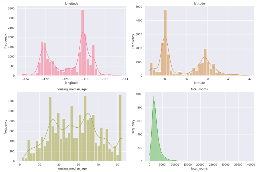
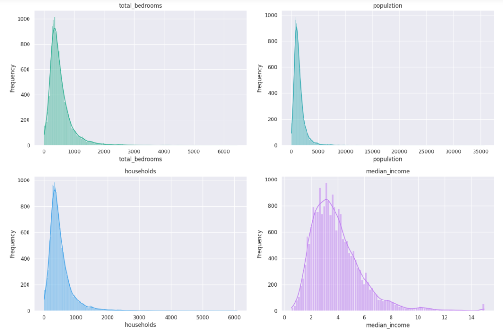
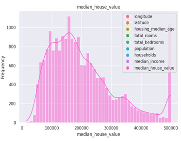
Interpretation Steps:
- Identify Central Tendency:
Locate the mode(s) or central peaks in the distribution. If the distribution is unimodal, the highest point often corresponds to the mode.
- Evaluate Spread:
Assess the width of the distribution to understand the spread or variability of the data. Wider distributions indicate greater variability.
- Examine Skewness:
Observe the symmetry or asymmetry of the distribution. Skewness can impact the interpretation of central tendency.
- Check for Outliers:
Look for data points that extend beyond the main body of the distribution. Outliers can be influential and may require attention.
- Consider Normality:
Assess whether the distribution appears normal or if there are deviations that need to be considered in subsequent analyses.
Step 9: Find out the relationship between different variables
Scatter Plot
A scatter plot is a visualization that displays individual data points on a two-dimensional graph, where each point represents values for two different variables. Here’s an example of how to create a scatter plot in Python using Matplotlib:
| plt.figure(figsize = (5, 4)) sns.scatterplot(x = ‘longitude’, y = ‘latitude’, hue = ‘median_house_value’, palette = ‘viridis’, data = df, alpha = 0.5) plt.title(“Geographic Distribution of Housing Prices”) plt.xlabel(“Longitude”) plt.ylabel(“Latitude”) plt.show() |
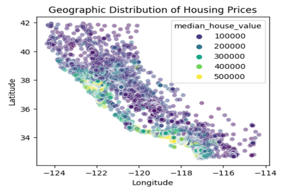
We observe that the houses near the ocean are more expensive as compared to houses away from the ocean. Hence, proximity to the ocean plays a huge role in deciding the price of the houses.
| sns.set(rc = {‘figure.figsize’:(11.7,8.27)}) sns.scatterplot(data = df, x = “population”, y = “median_house_value”, hue = “ocean_proximity”, palette = “rocket”, alpha = 0.4).set( title = “How does price of house change with population and ocean proxmity – PLOT 1”, xlabel = “Population”, ylabel = “House Price” ) plt.show() |
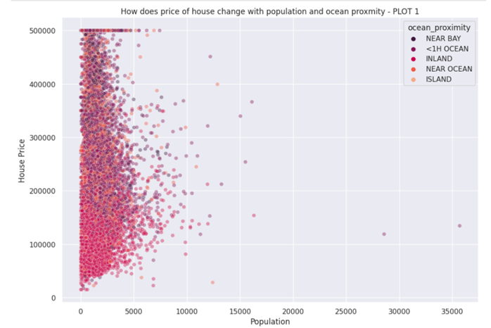
We observe that most of the houses are Inland, with a price between 30,000 to 160,000. Most of the near bay and <1H Ocean as well as Near Ocean are around 300,000-500,000. Island seems to be in every price range.
Violin Plot:
A violin plot is used to visualize the distribution of a numeric variable for different categories or groups. It combines aspects of a box plot and a kernel density plot. Here’s an example of how to create a violin plot in Python using Seaborn:
| plt.figure(figsize = (8, 4)) sns.violinplot(x = ‘ocean_proximity’, y = ‘median_house_value’, data = df, palette = ‘viridis’) plt.title(“Relationship between Ocean Proximity and Median House Value”) plt.xlabel(“Ocean Proximity”) plt.ylabel(“Median House Value”) plt.show() |
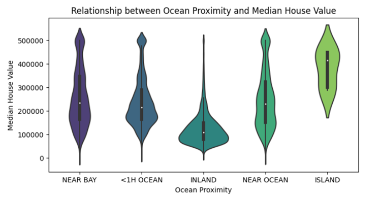
Interpretation Steps:
- Density and Concentration:
Examine the width and shape of the violin to identify regions of high or low data density. A concentrated area may indicate a mode or peak in the distribution.
- Comparison Across Categories:
If multiple violins are present, compare their shapes to understand differences in the distributions between categories. Look for variations in central tendency, spread, and shape.
- Skewness and Symmetry:
Assess the symmetry or skewness of each violin. Symmetry suggests a balanced distribution, while skewness may indicate an asymmetric distribution.
- Outliers:
Check for outliers beyond the tails of the violins. Outliers may be represented as individual points outside the whiskers.
Step 10: Visualizing categorical variables
Count plot
A count plot is a bar plot that shows the count of occurrences of unique values in a categorical variable. It’s often created using Seaborn. Here’s an example of how to create a count plot in Python:
| plt.figure(figsize = (6, 4)) sns.countplot(x = ‘ocean_proximity’, data = df) plt.title(“Distribution of Ocean Proximity”) plt.xlabel(“Ocean Proximity”) plt.ylabel(“Count”) plt.show() |
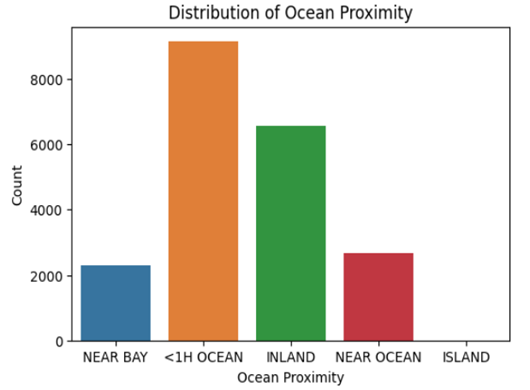
The number of houses which are less than one hour from the ocean are maximum.
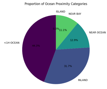
Pie chart:
A pie chart is a circular statistical graphic that is divided into slices to illustrate numerical proportions. Here’s an example of how to create a pie chart in Python using Matplotlib:
| plt.figure(figsize = (6, 6)) df[‘ocean_proximity’].value_counts().plot.pie(autopct = ‘%1.1f%%’, startangle = 90, cmap = ‘viridis’) plt.title(“Proportion of Ocean Proximity Categories”) plt.ylabel(“”) plt.show() |
Step 11: Deep dive into important variables
| sns.set(rc = {‘figure.figsize’:(8,6)}) sns.kdeplot(x = ‘population’, y = ‘median_house_value’, data = df, fill=”True”, color = “salmon”).set( title = “Most common house prices”, xlabel = “Population”, ylabel = “House Price” ) plt.show() |
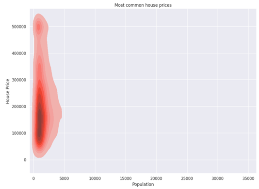
We observe that mostly house prices in CA, lie between 50,000-280,000.
Benefits of Exploratory Data Analysis:
Exploratory Data Analysis (EDA) plays a crucial role in the data analysis process and offers several important benefits:
- Understanding the Data:
EDA helps in gaining a deeper understanding of the dataset. It allows you to become familiar with the structure, patterns, and characteristics of the data.
2. Identifying Patterns and Trends:
EDA helps in uncovering patterns, trends, and relationships within the data. Visualization techniques, such as scatter plots and line charts, can reveal insights that may not be immediately apparent in raw data.
3. Detecting Anomalies and Outliers:
EDA helps in identifying anomalies and outliers in the data. Outliers can significantly impact the results of statistical analyses and machine learning models, and EDA provides an opportunity to decide how to handle them.
4. Handling Missing Data:
EDA helps in identifying missing data and deciding on appropriate strategies for handling it. Understanding the extent and patterns of missing data is essential for making informed decisions about imputation or exclusion.
5. Feature Engineering:
EDA can inspire feature engineering by revealing potential relationships or interactions between variables. Creating new features or transforming existing ones based on insights gained from EDA can enhance the performance of machine learning models.
6. Validating Assumptions:
EDA allows you to validate assumptions made during the initial stages of the analysis. It helps in confirming or refuting hypotheses and ensuring that the analysis aligns with the goals of the project.
7. Model Selection and Evaluation:
EDA provides insights that can guide the selection of appropriate models. It also aids in evaluating model assumptions and understanding the features that are likely to have a significant impact on model performance.
8. Communicating Results:
EDA is essential for effectively communicating results to stakeholders. Visualizations and summaries produced during EDA help in telling a compelling and data-driven story about the dataset.
9. Improving Data Quality:
EDA often reveals data quality issues, such as inconsistencies, errors, or inaccuracies. Addressing these issues early in the analysis process improves the overall quality and reliability of the results.
10. Guiding Further Analysis:
EDA guides the direction of further analyses and investigations. It helps in formulating more focused research questions and hypotheses for subsequent stages of the analysis.
In summary, EDA is a foundational step in the data analysis workflow. It provides valuable insights that influence decision-making at various stages of a project, from data preprocessing to model building and interpretation of results. Rydot Infotech is your one-stop solution. From data management & analytics and business intelligence platforms, Artificial Intelligence Development Services, AI Software Development, to Microsoft Azure Cloud Services. you’ll find all the services served on a single plate. We have more! Contact us today.